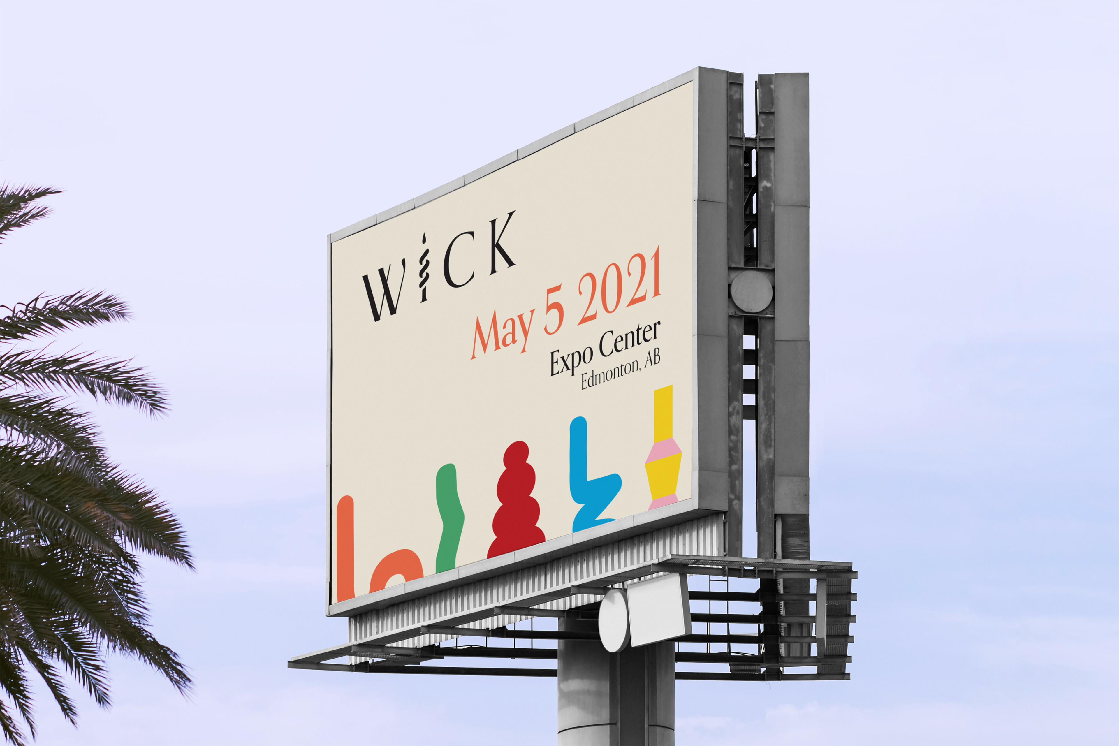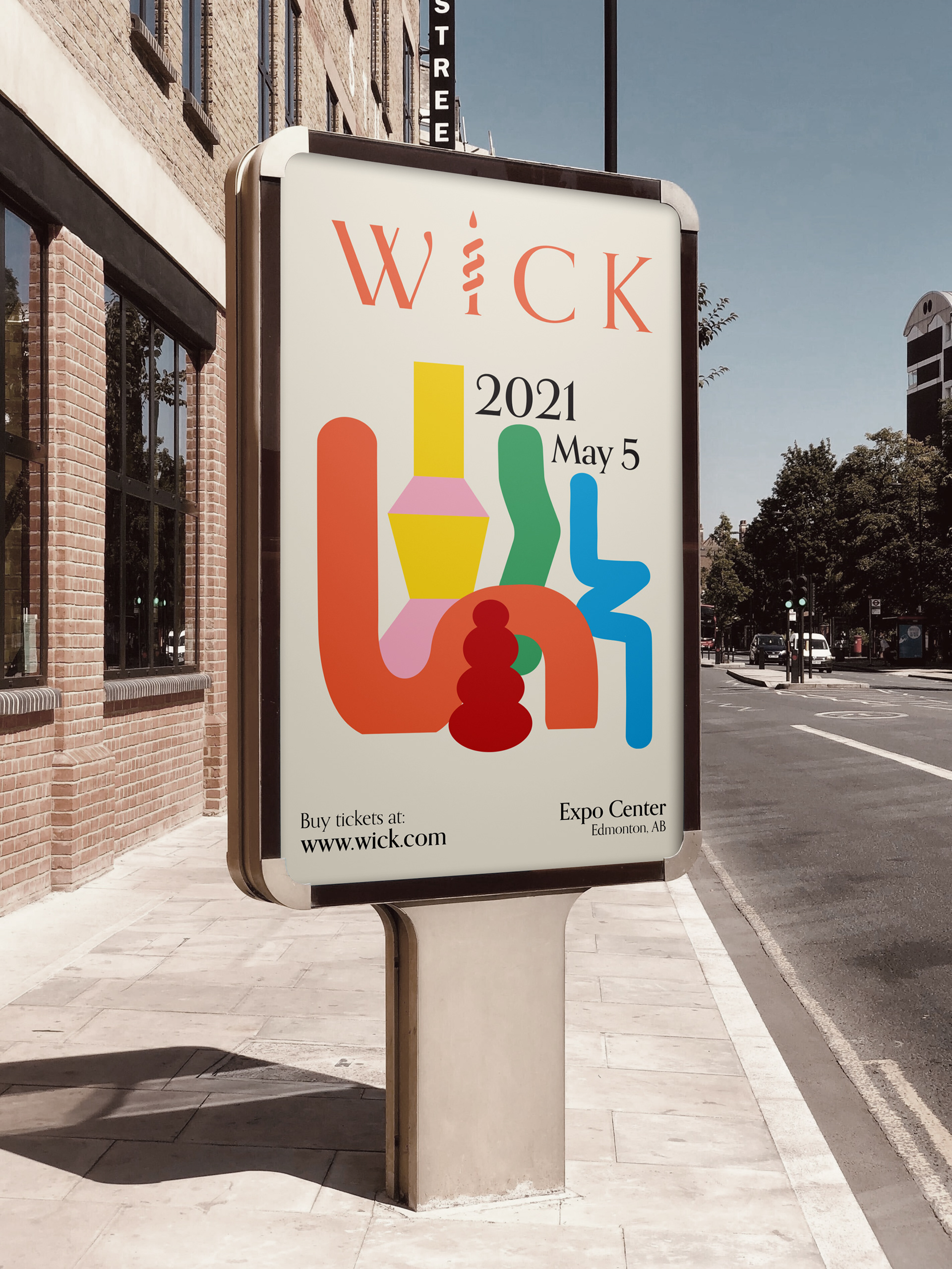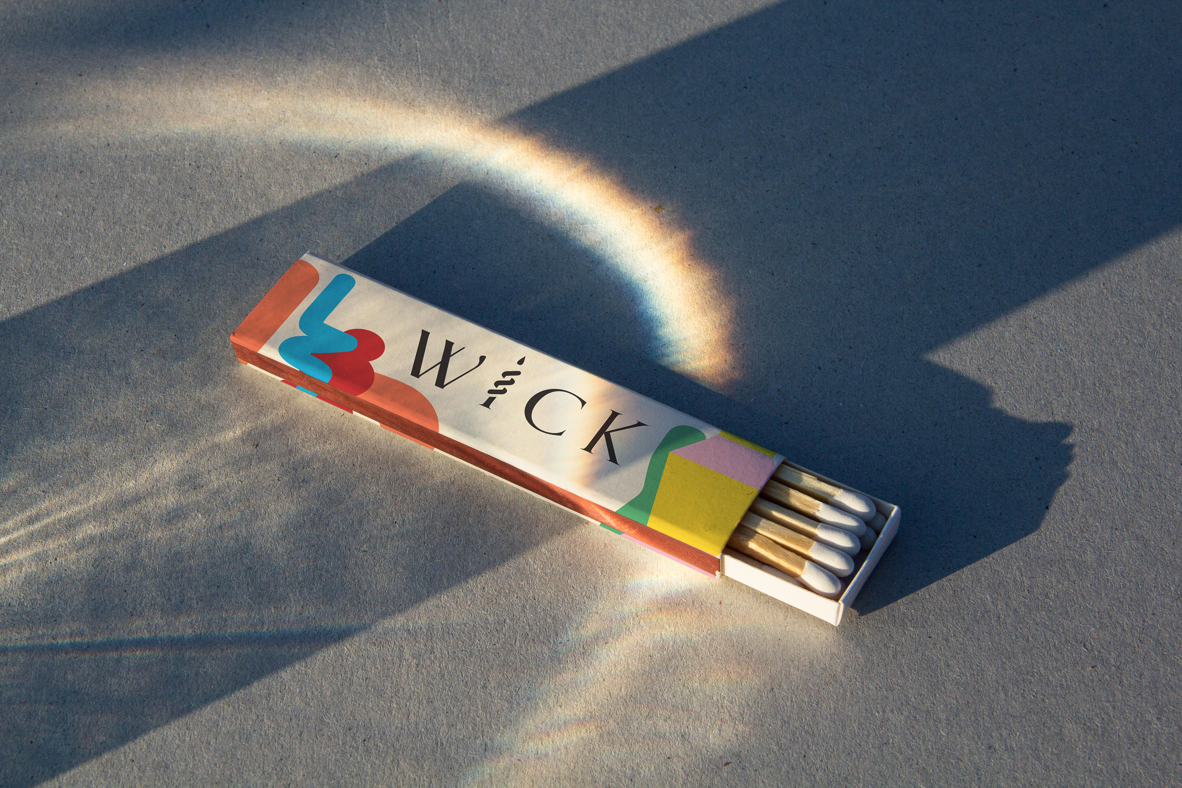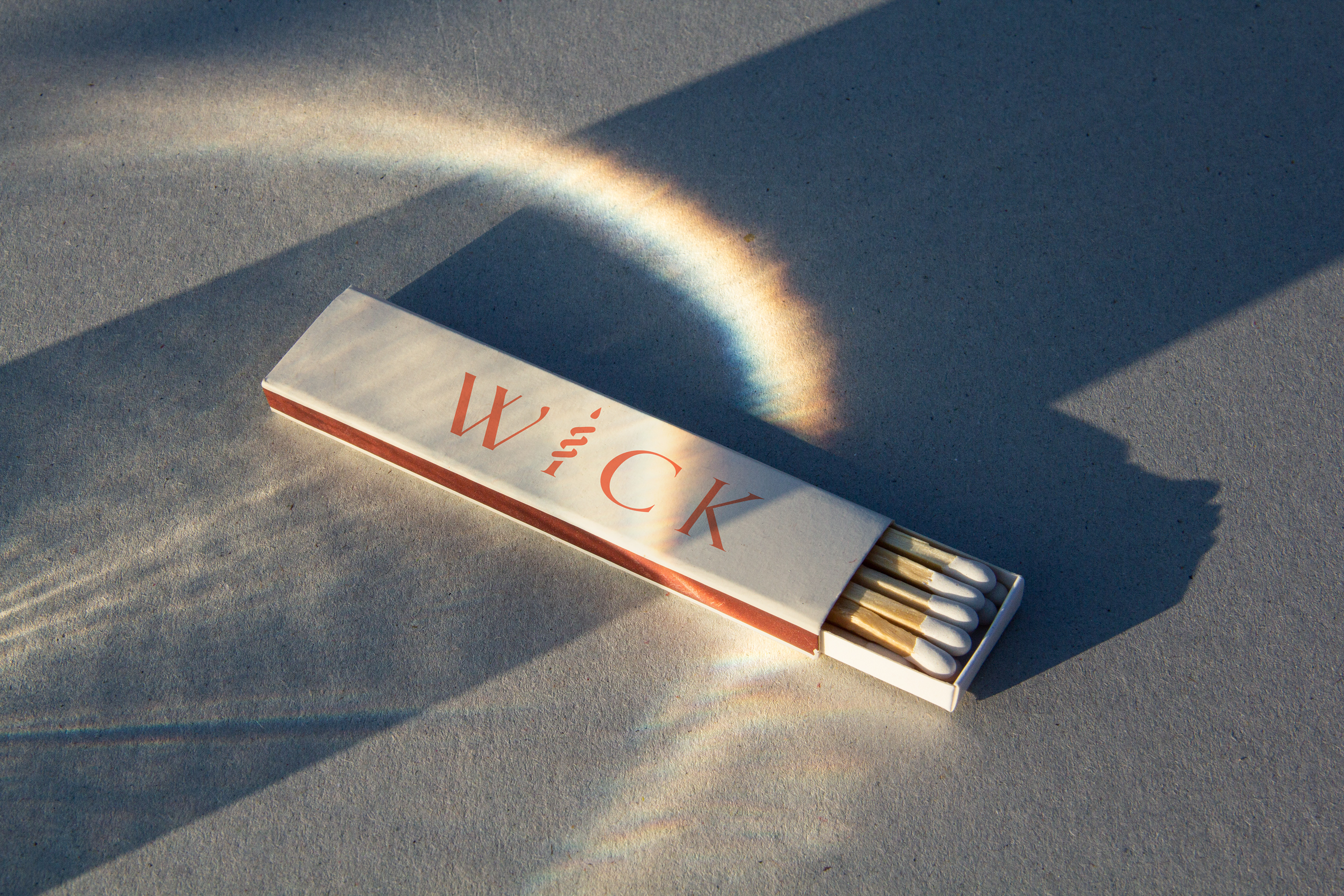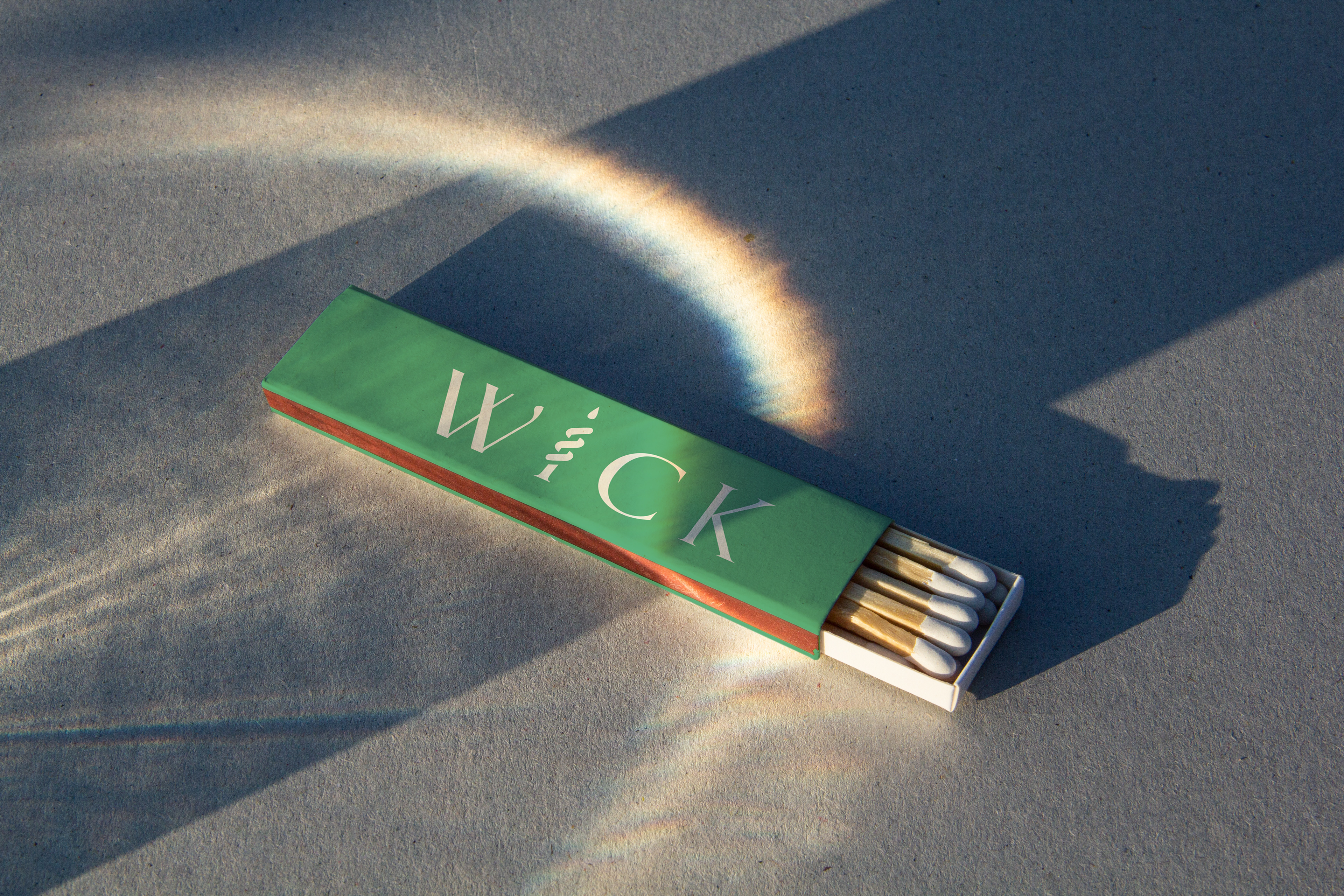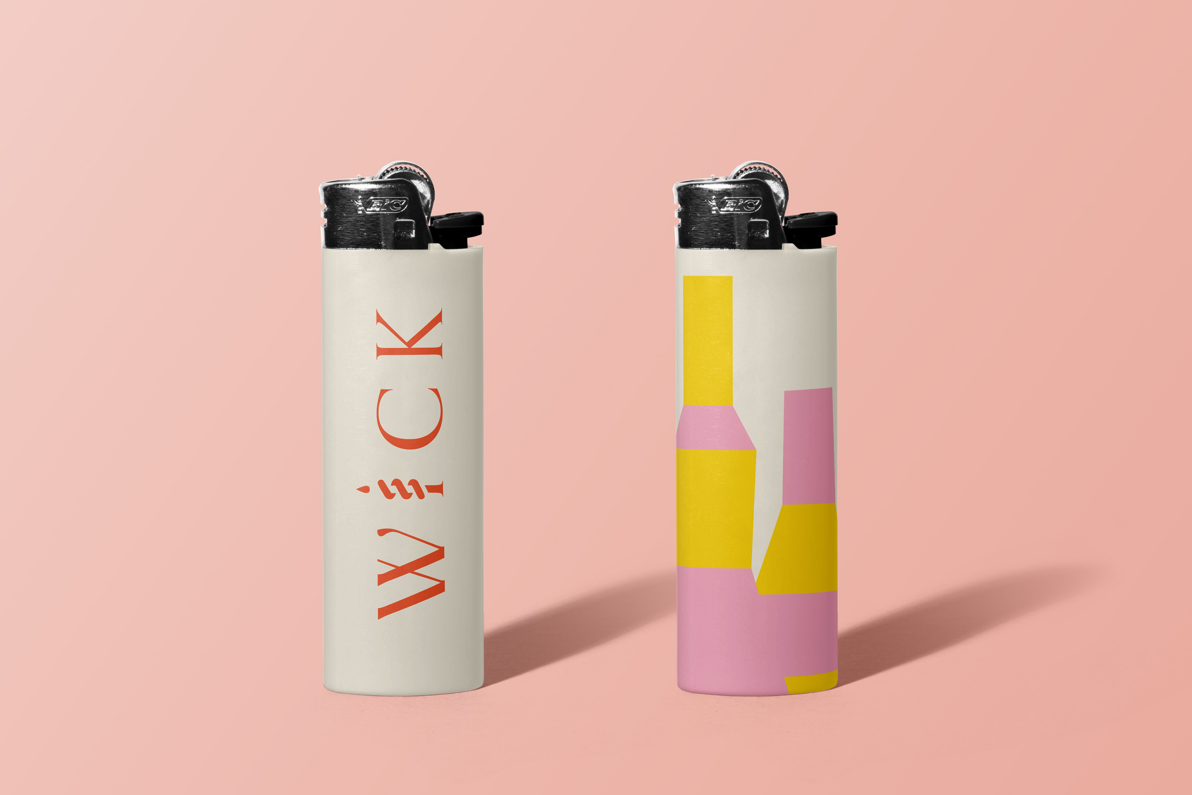
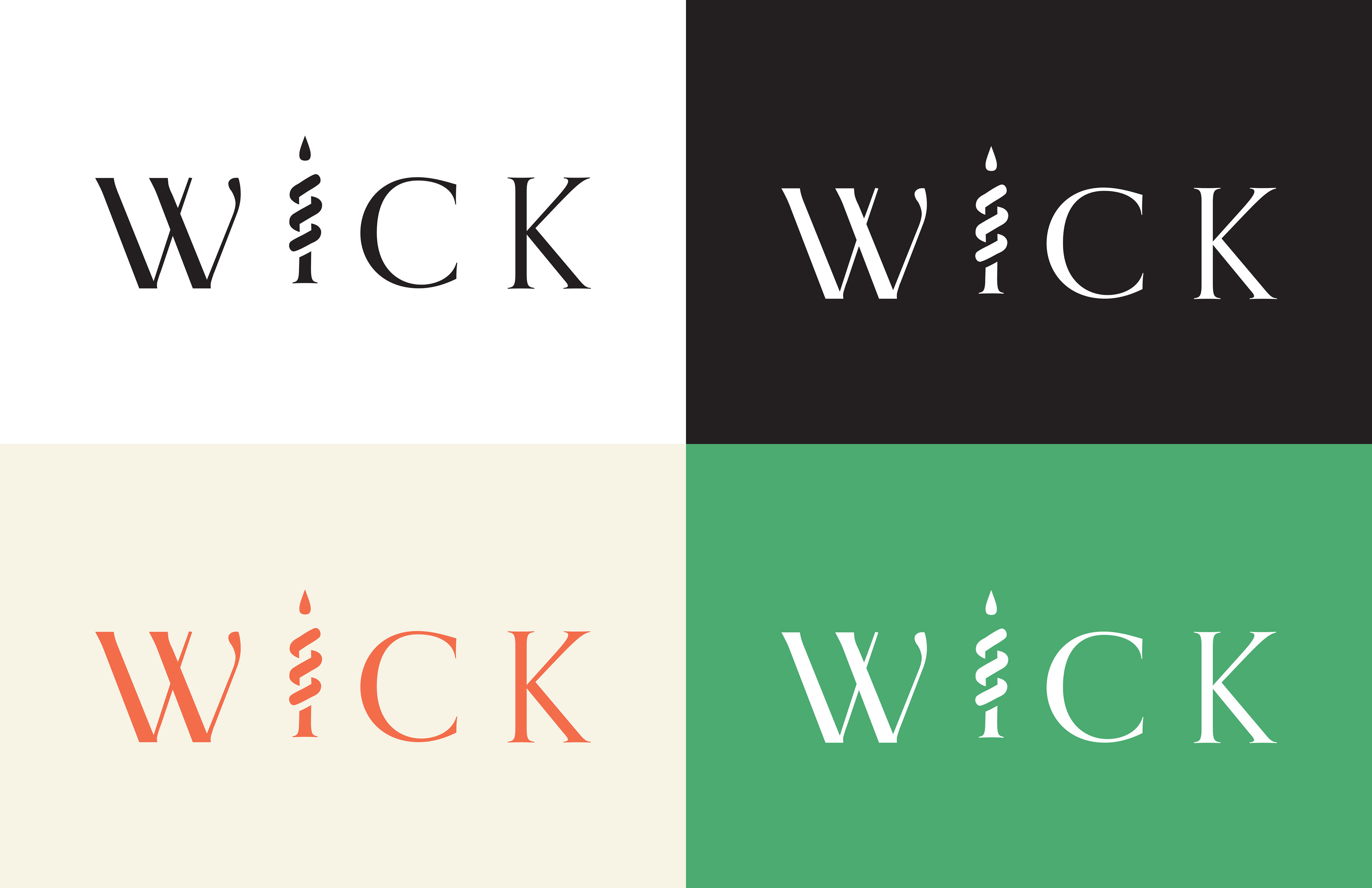
The logo unites elegance and playfulness by using serif typeface and a swirly shape of a popular structural candle wrapped around the “I”. This logo is simple yet versatile as it can utilize the brand’s bright colours to bring connection with the illustrative candles designed for the system or stay black and have the candles do all the work.
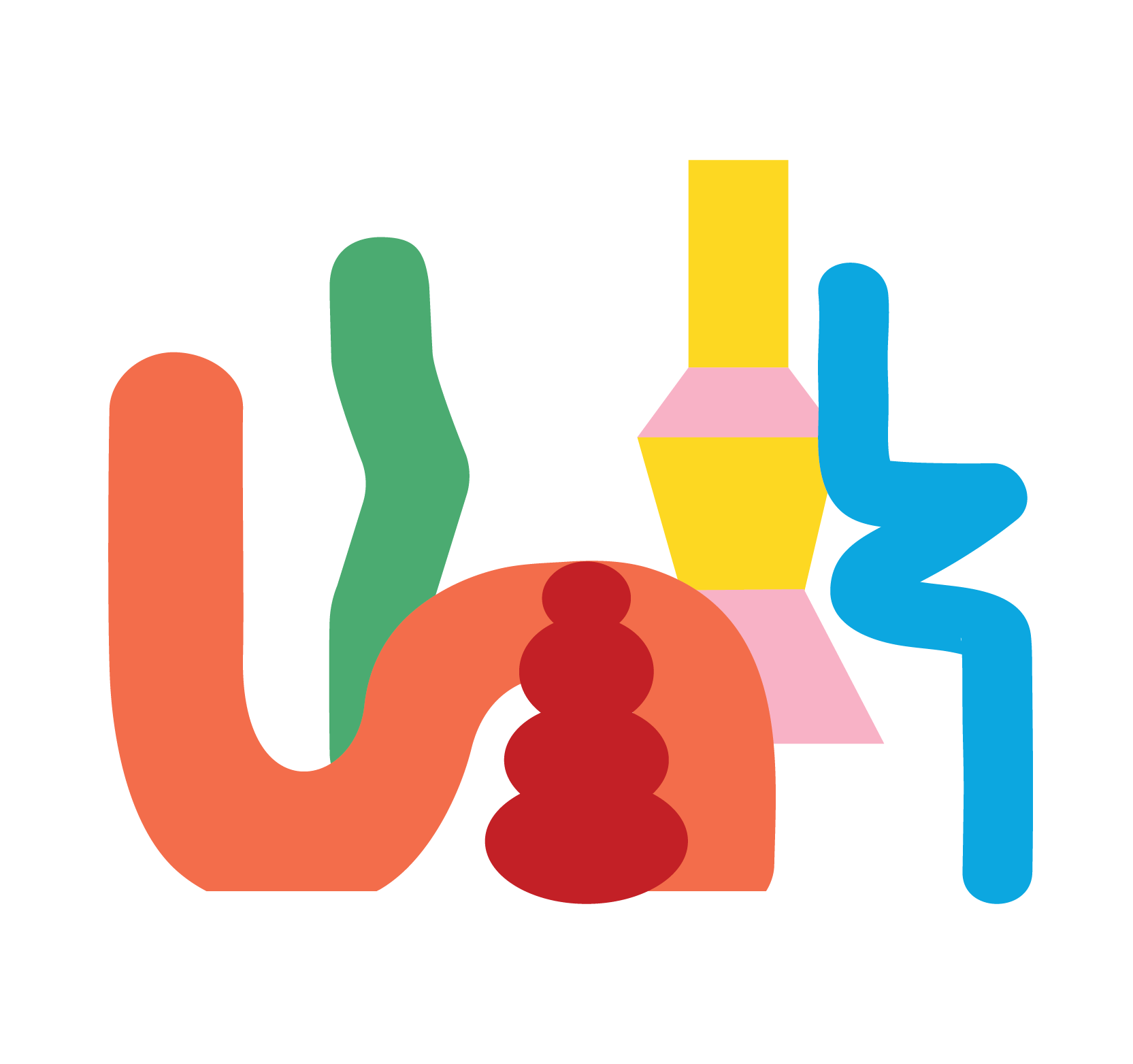
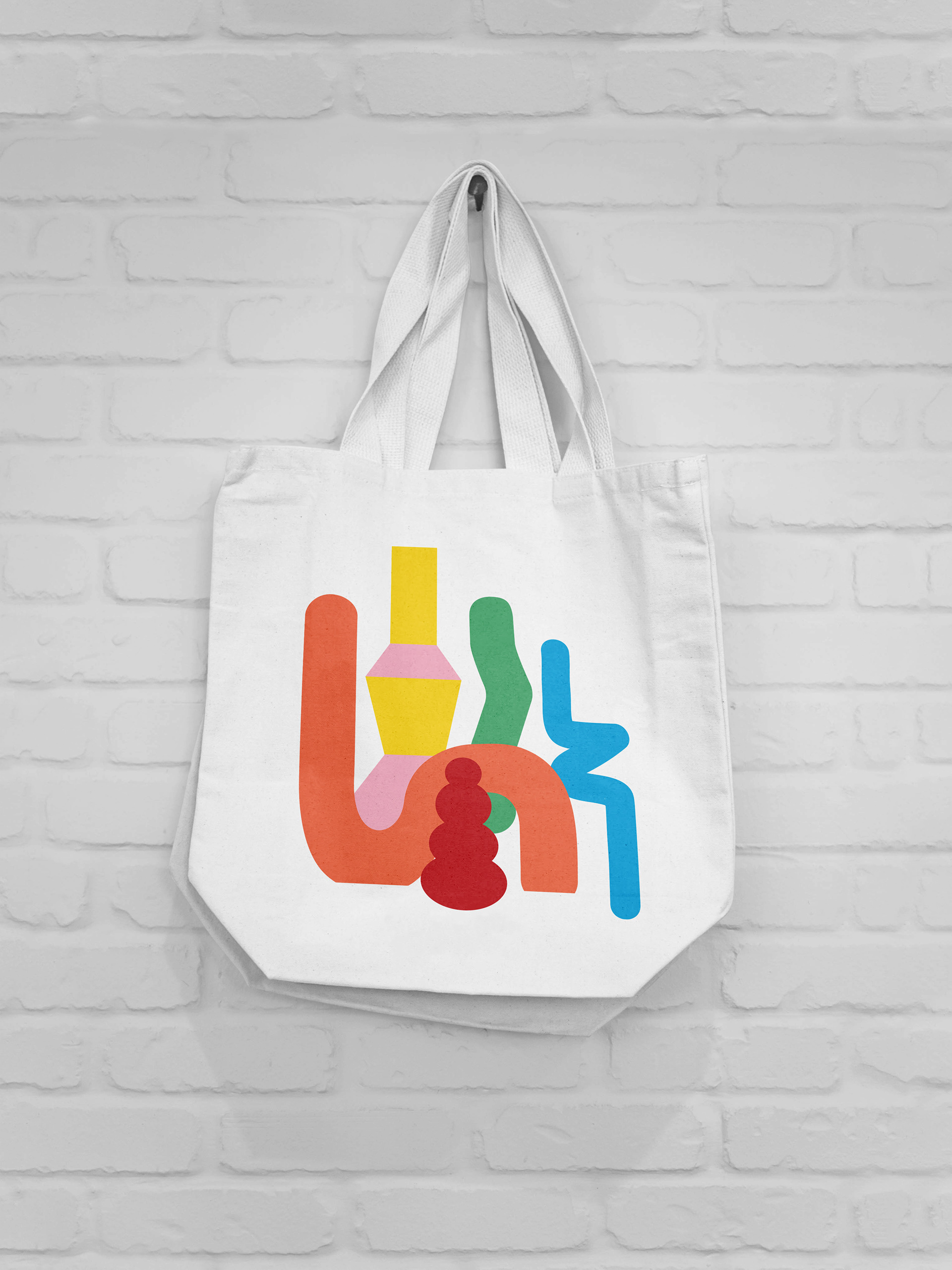
These groovy forms are fun, and each has its personality allowing it to be used separately or together, playing around with the spatial aspect of Wick’s brand. They were designed with the most popular structural candles in mind and are so flexible they can be expanded to create abstract visuals or shrunken to be sitting together as a family.
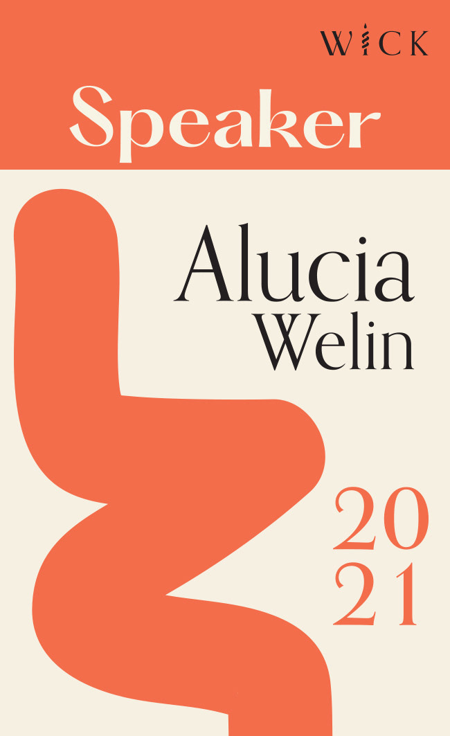
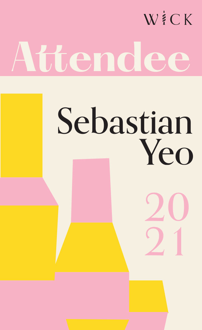
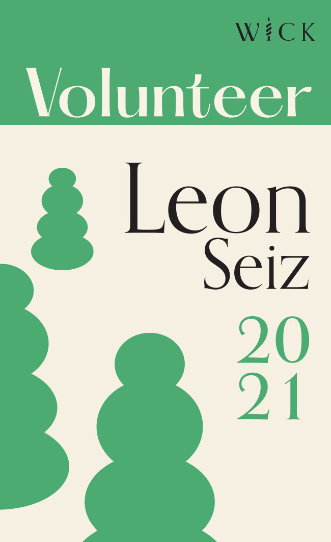
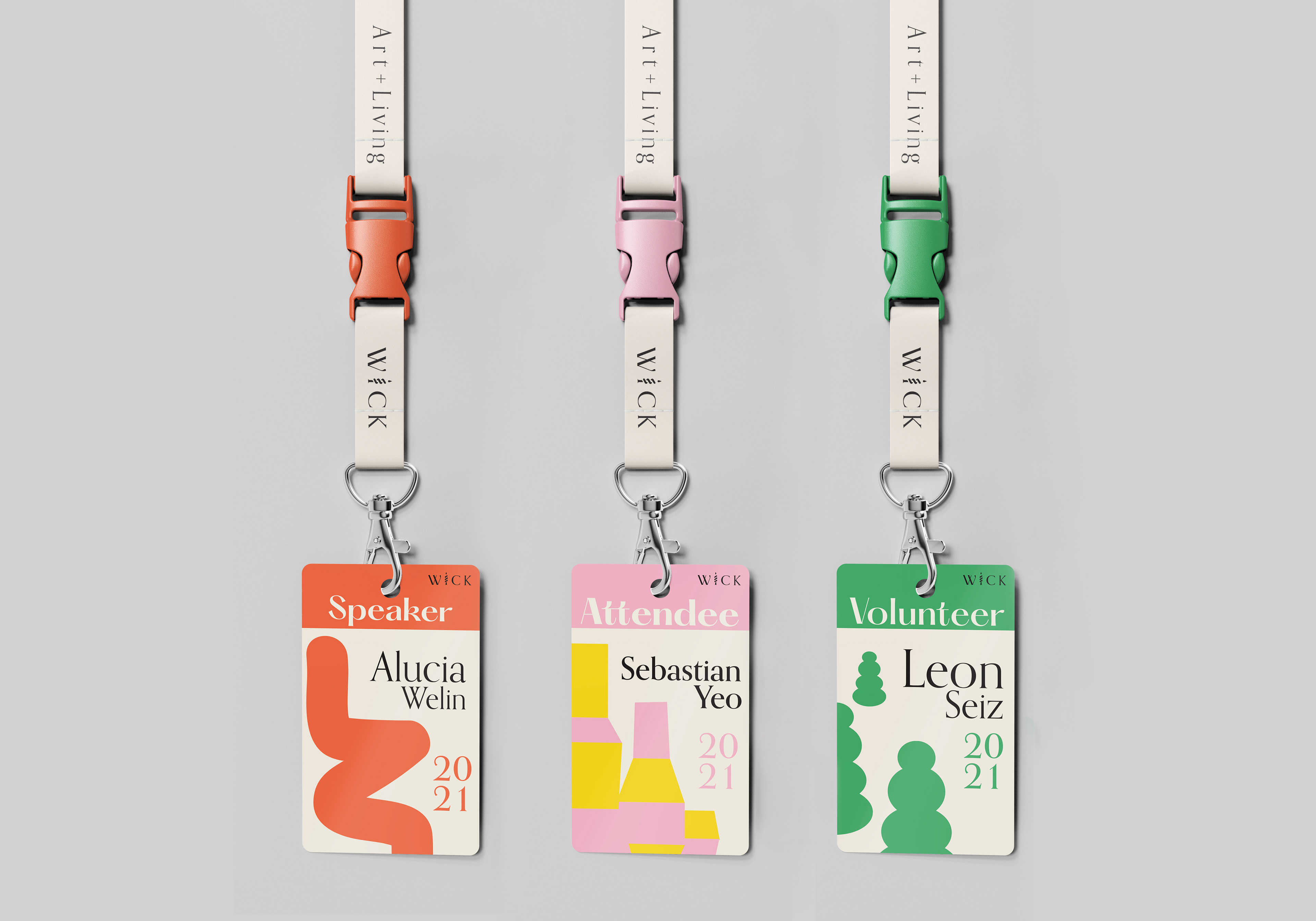
The badges are one of the most prominent ways the illustrative forms can be used to differentiate from each other. Strategically placing them to create room for the text of people attending the expo whilst also have a colour coordinated band at the very top of the badge to showcase their title. The solid colour coordination with black and the brand’s base colour create a united brand element for people to identify. The lanyard also showcases the brand’s tagline reminding the importance of connecting art with living in our everyday lives
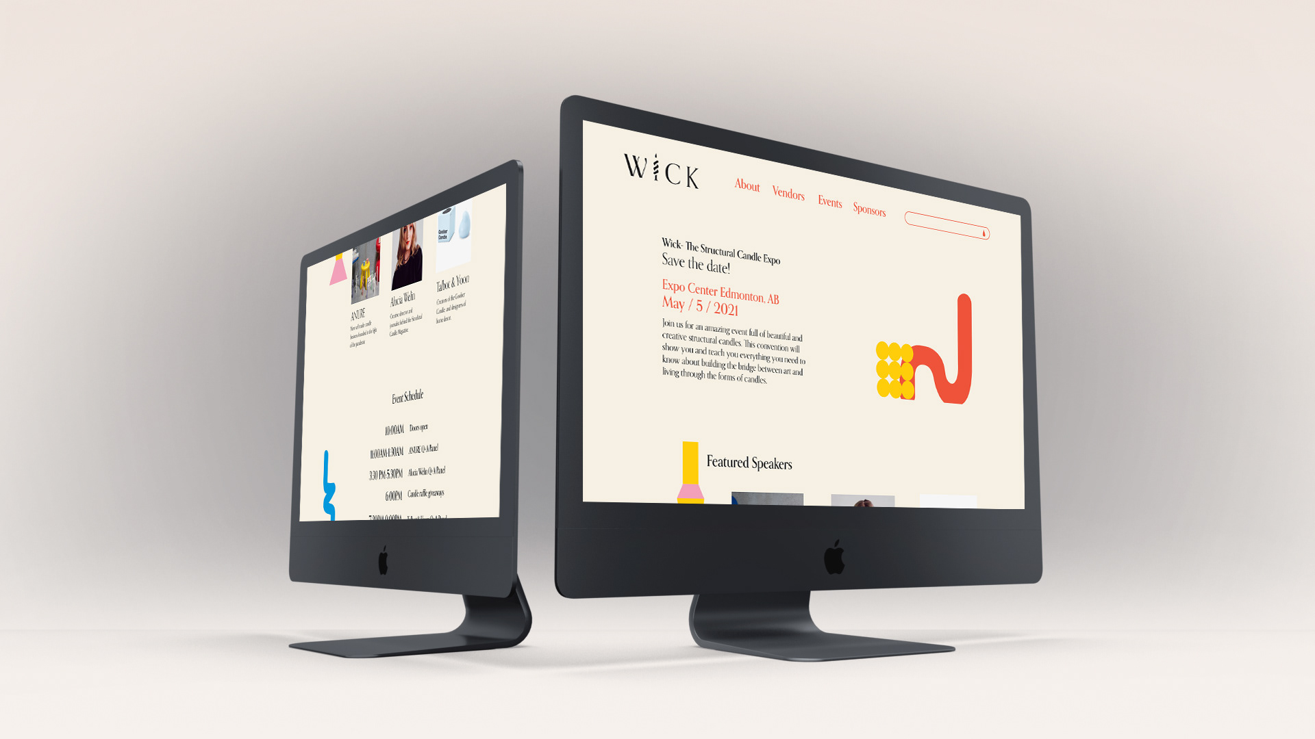
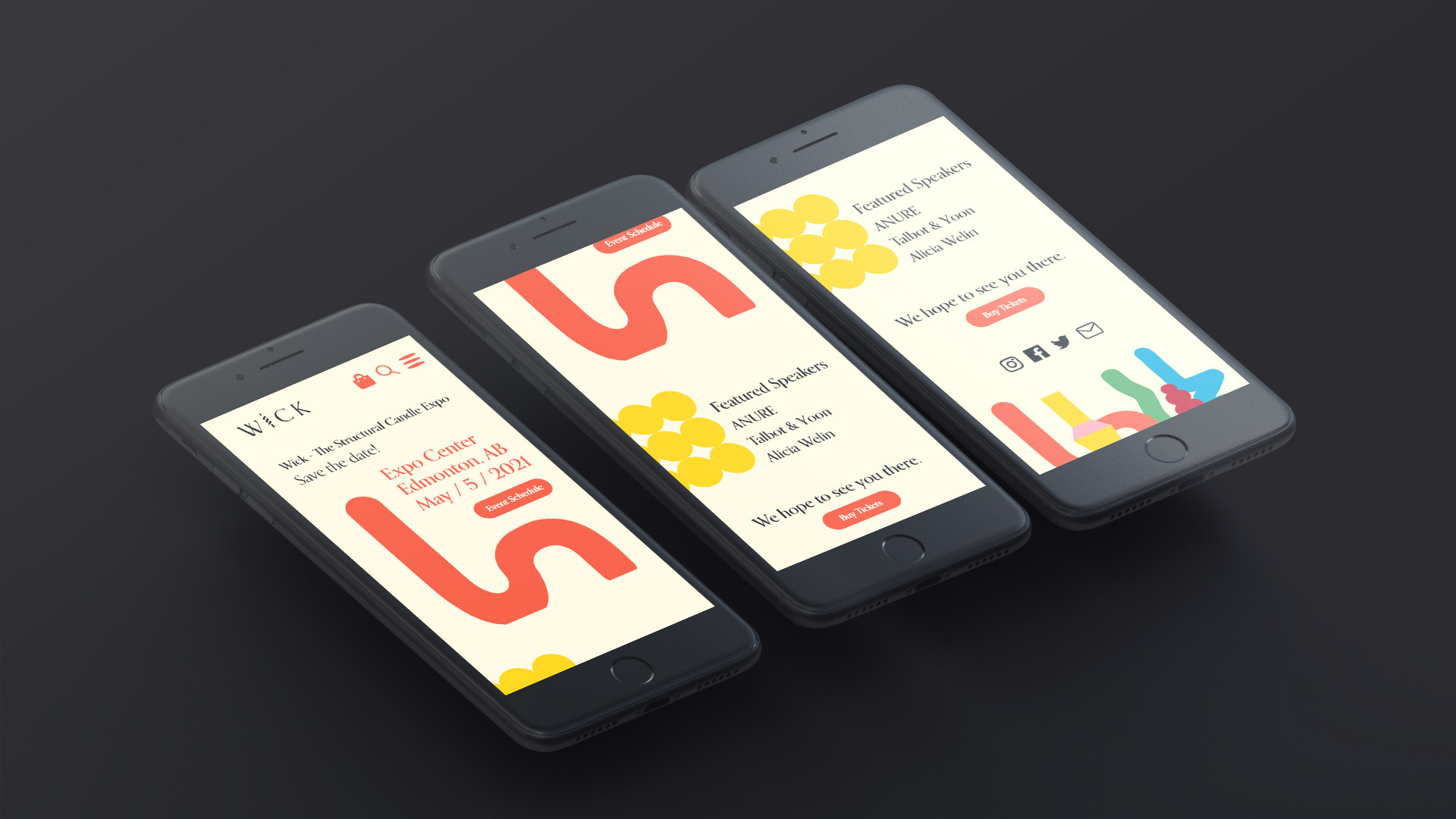
The landing page for both desktop and mobile was designed to take the user on a virtual tour of the actual expo. Placing the illustrative structural candles in different areas to section text away from each other while also be visual identifiers when the user scrolls down gives them a pleasant and playful experience. The mobile version has the forms expanded, making them appear more abstract while ending it off at the bottom with a cheeky sneak peek at the candles’ bottom.