Brand Guideline at A Glance
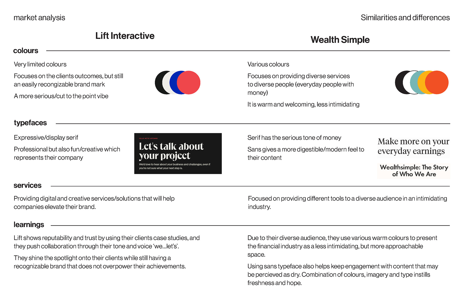
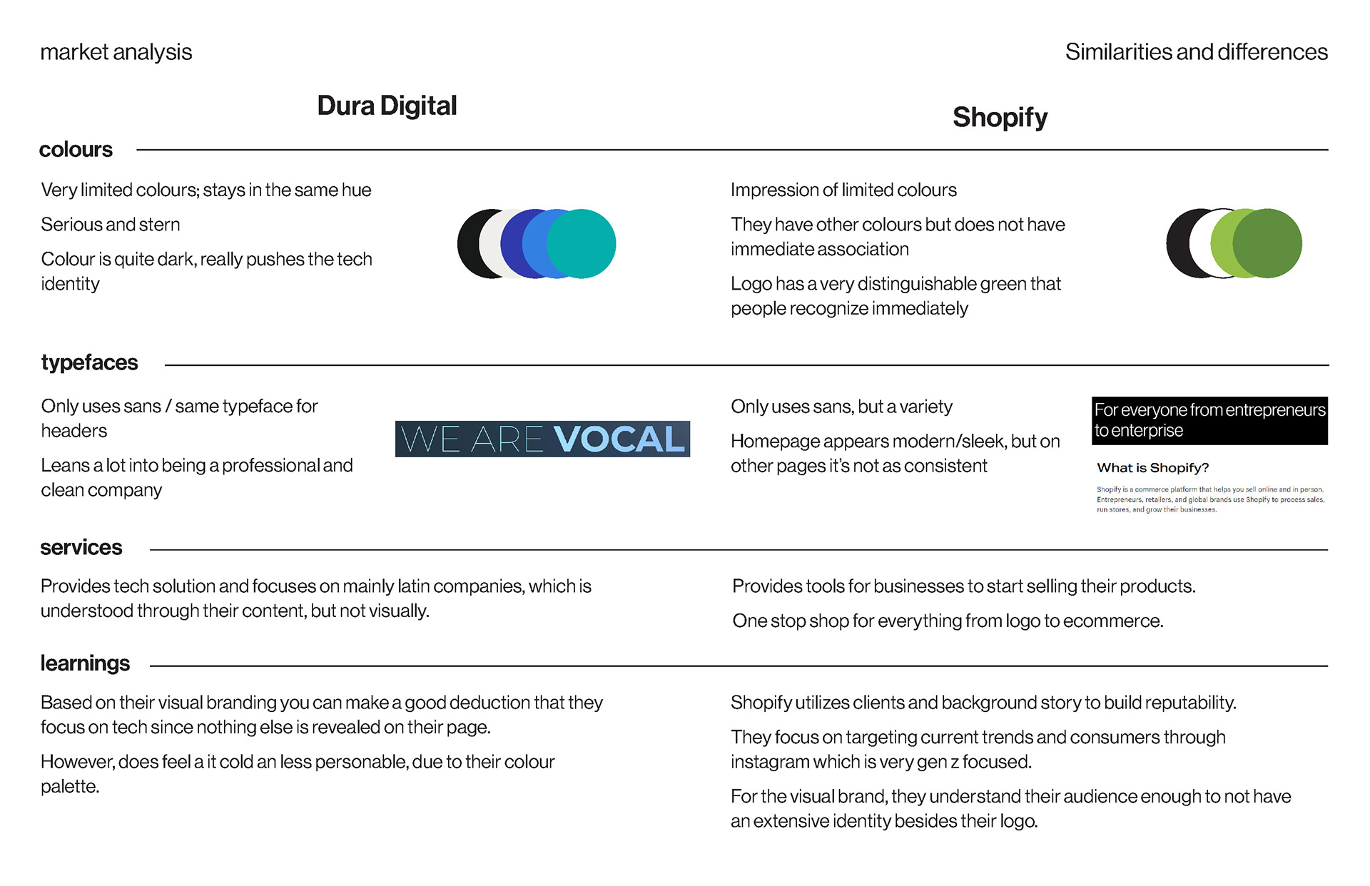
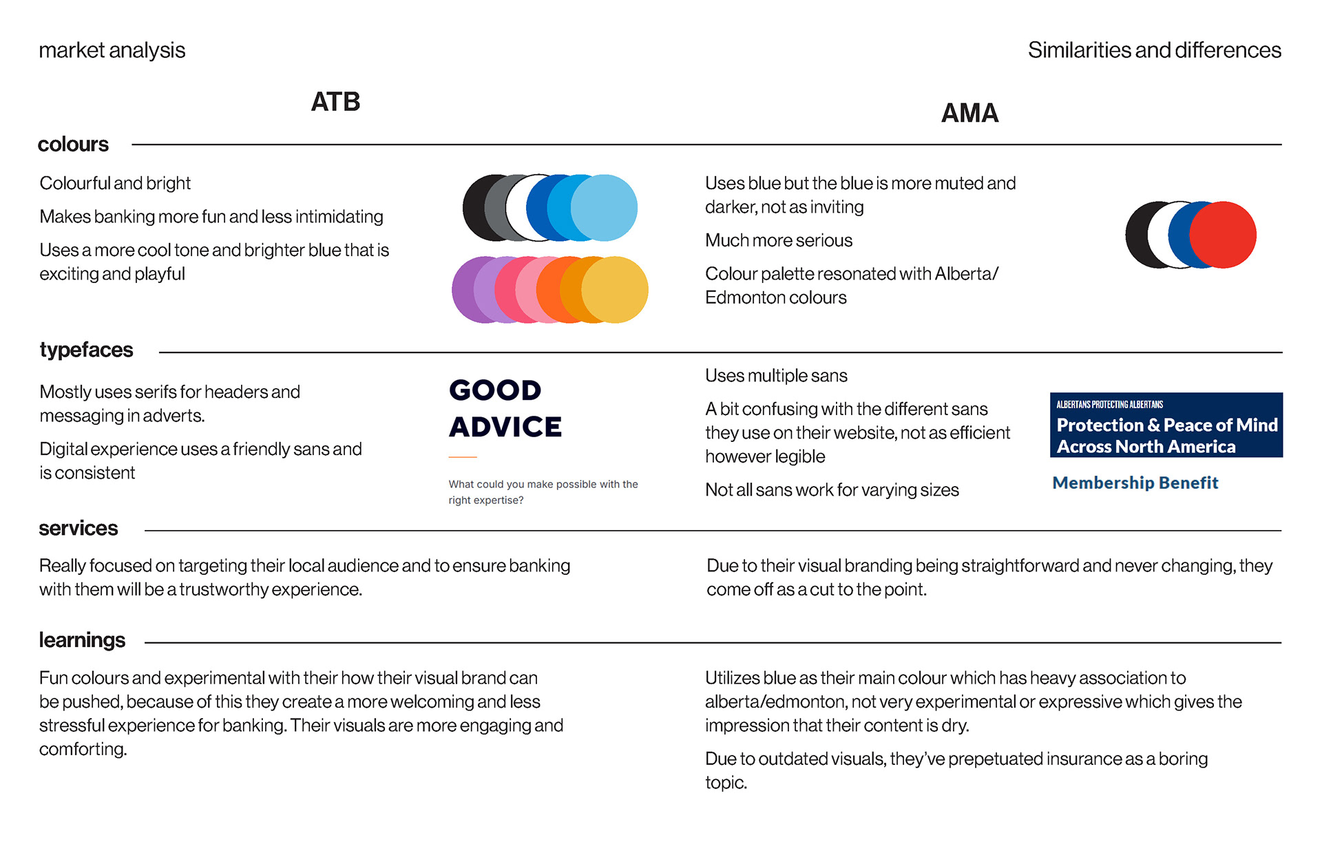
I began with a comprehensive market analysis of Saikyo's industry competitors and companies that are either directly related to Saikyo or not. Doing this allows me to look for similarities and differences that could help guide me during the concept ideation phase. Curating a list of points to target and avoid. It also aided in communicating to my client my reasoning behind certain aesthetics and styles to avoid.
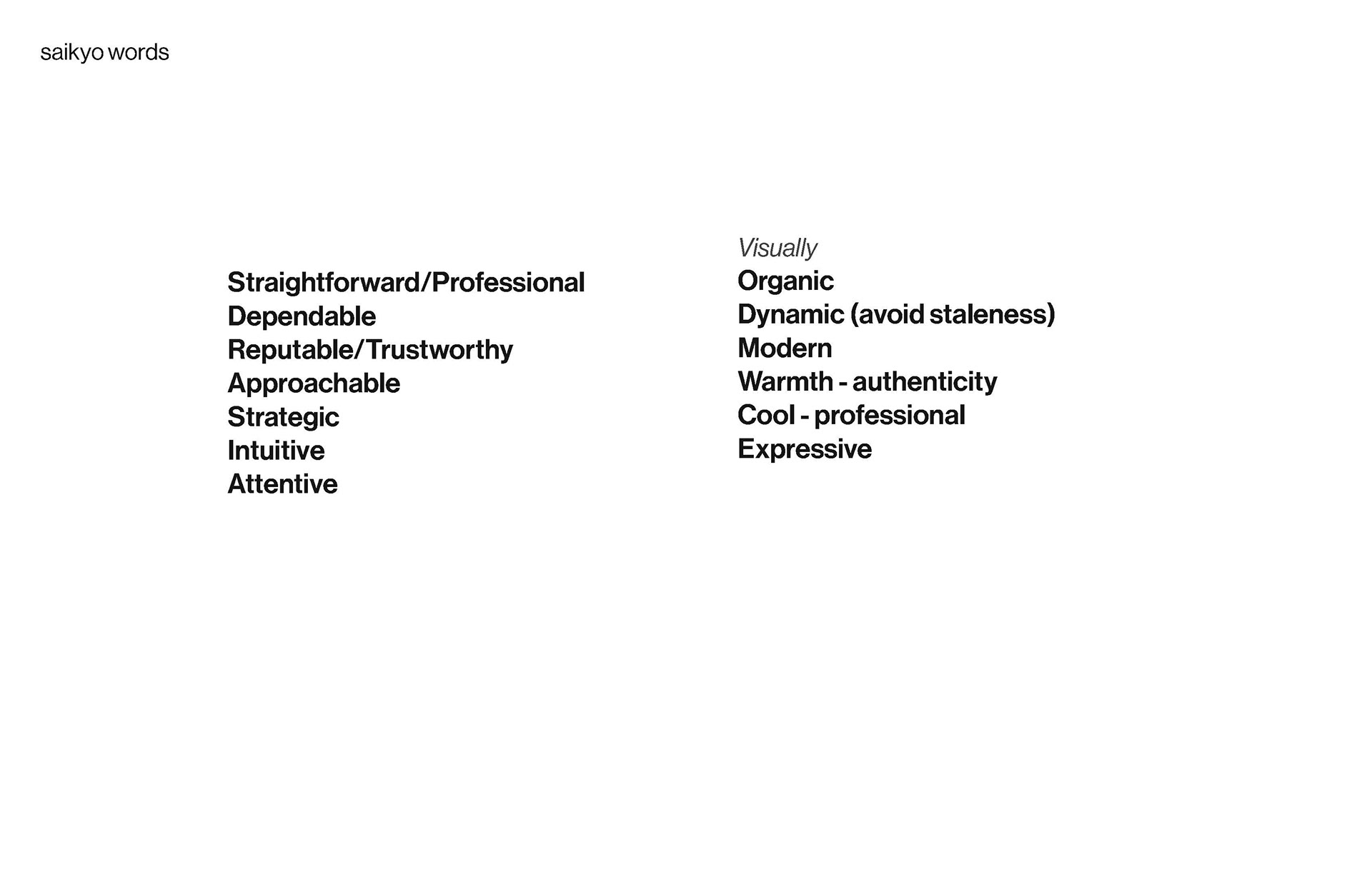

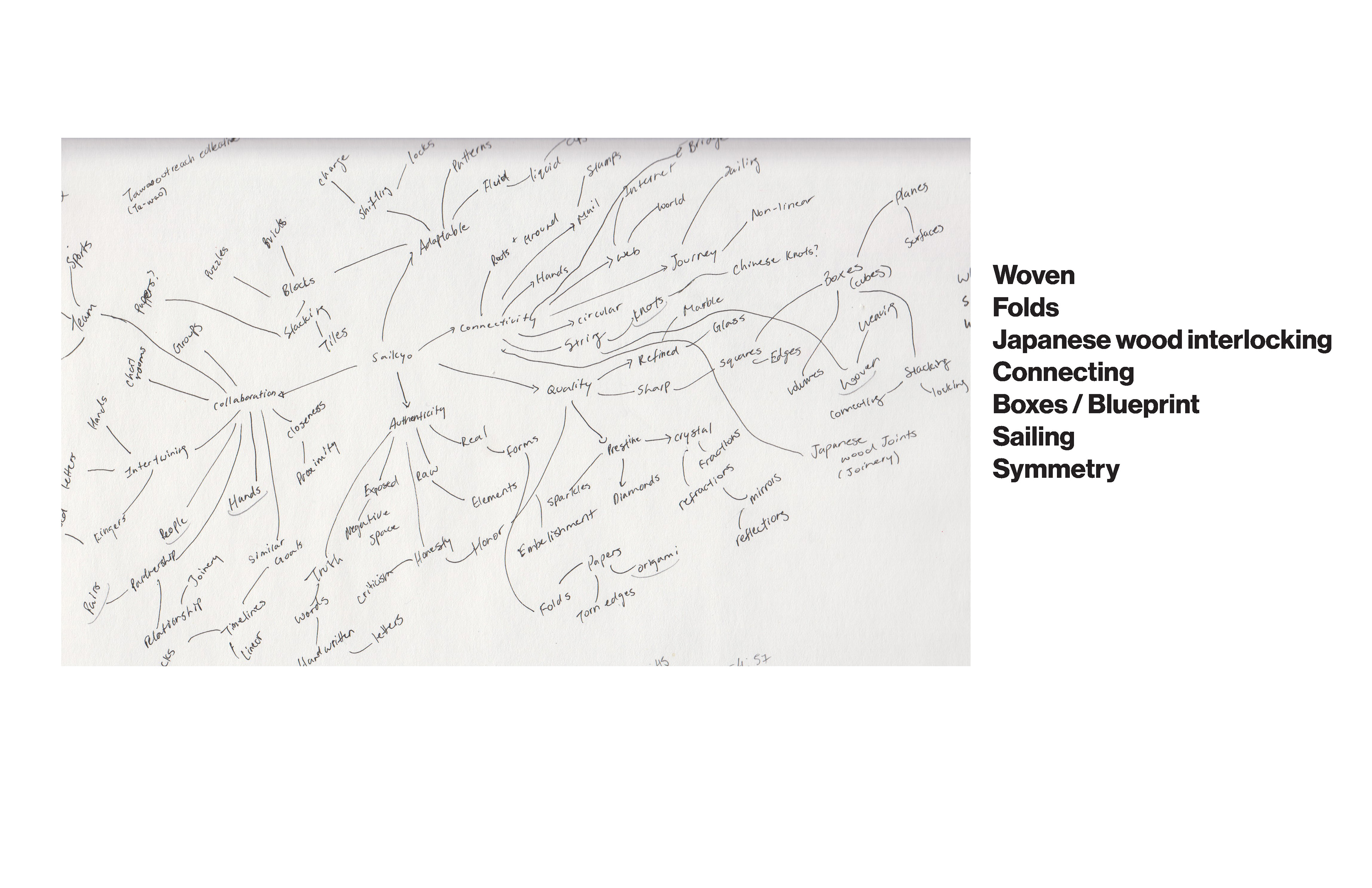
After the market analysis, I moved forward with curating visual words that could represent the company's values and missions. Creating a mindmap and sketching any shapes and patterns that could relate back to the list of Saikyo words.
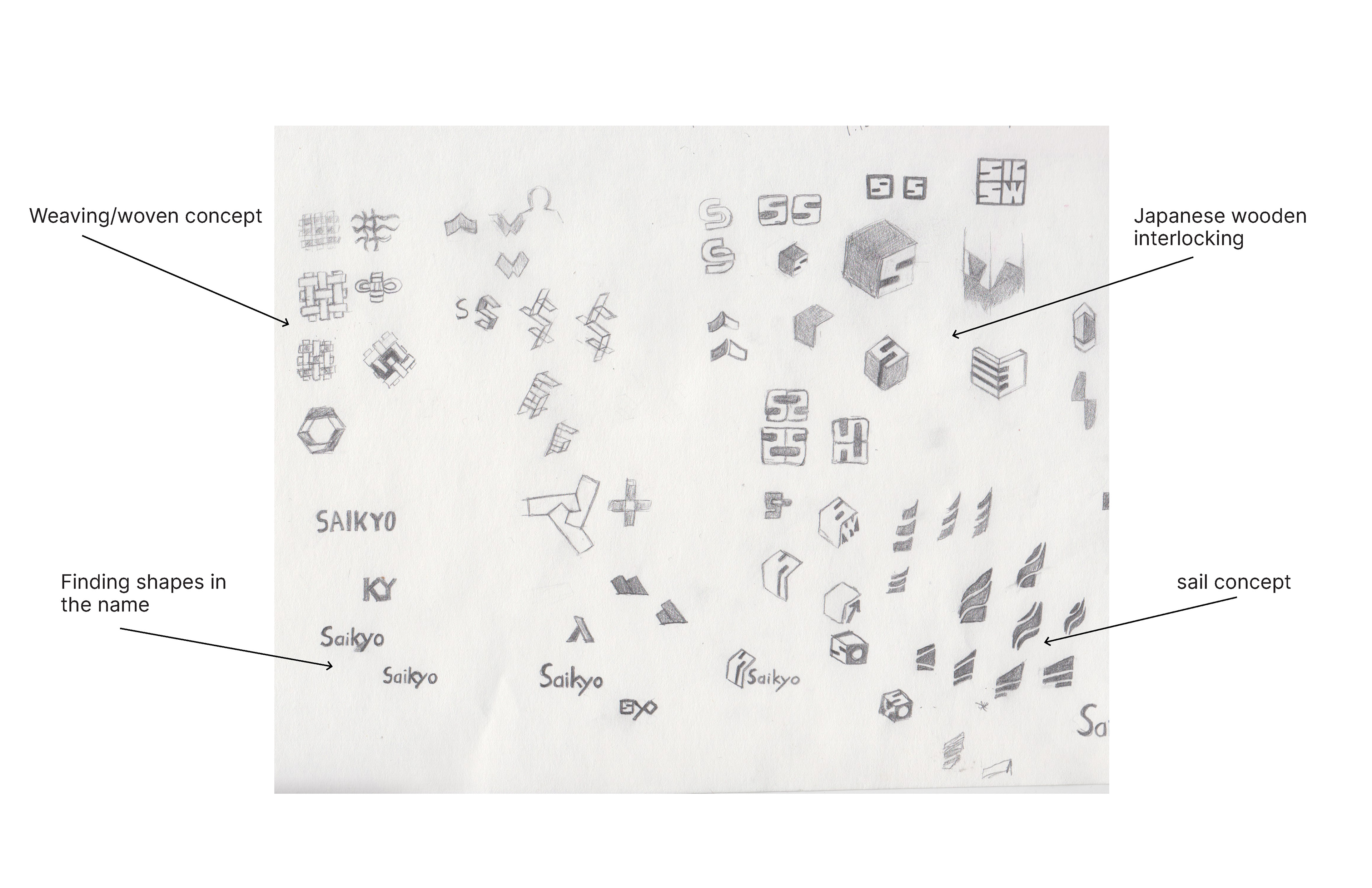
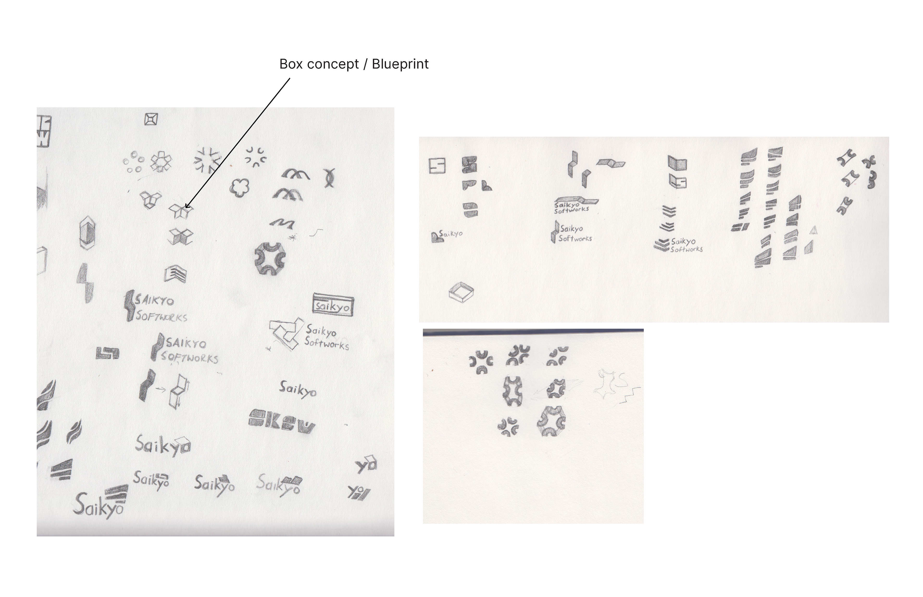
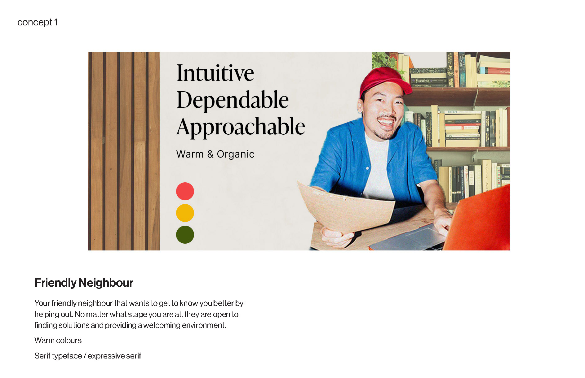
On the same stage of sketching the logo, I created three concepts to represent the brand as a whole: Friendly Neighbour, Life Coach, and Teacher Assistant. Creating these concept identities was a tool to ensure both the client and I were on the same page. At the same time, it effectively communicated to the client in terms that they could understand, through seeing and feeling a persona, instead of words describing shapes and colours.


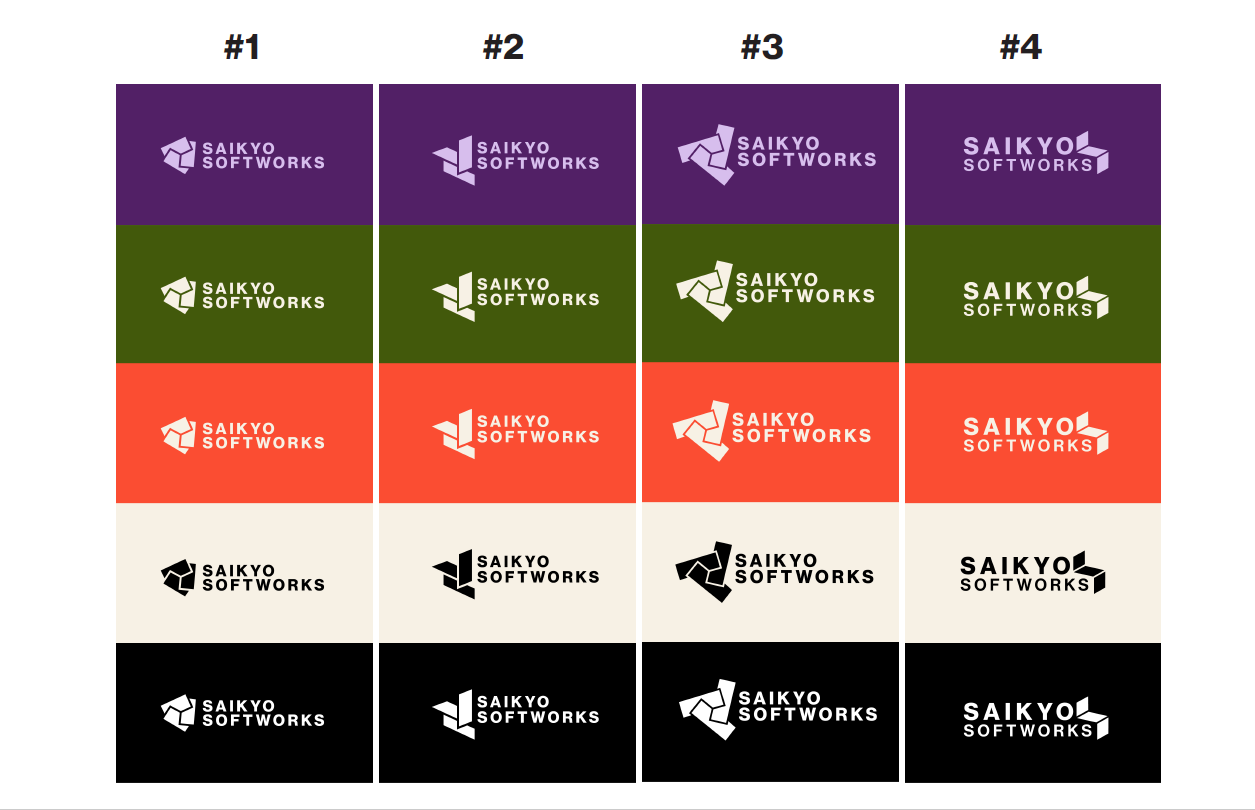
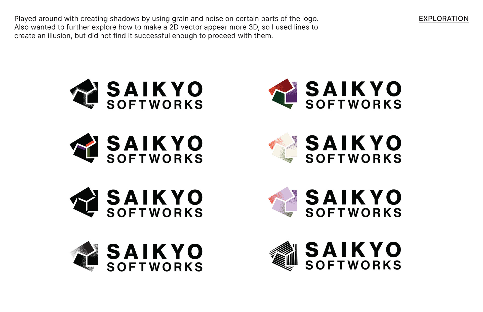
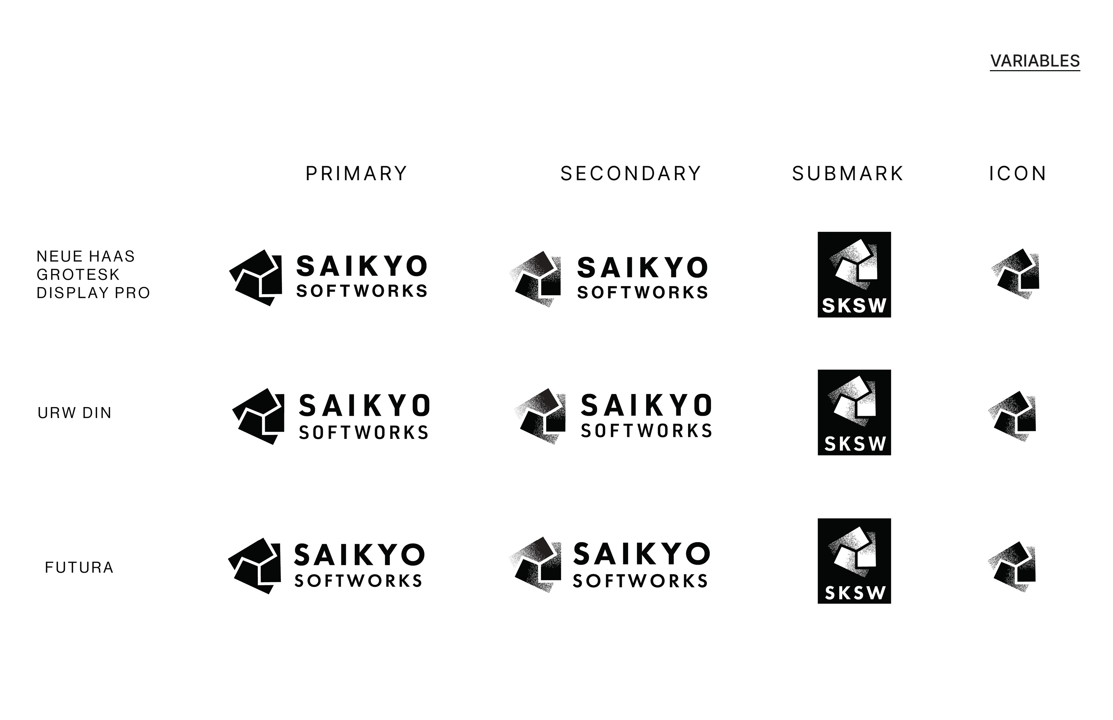
After multiple rounds of feedback, four logos were refined to finally one being chosen and further explored. I pushed myself to see how far the logo could be manipulated and later pulled back.
